PRODUCT STRATEGY FOR A DATA CATALOG
What is a Data Catalog? - A challenge emerging global product companies face today is in handling their data, which is often spread geographically and is in a variety of different data formats, making it very difficult to access that data centrally. A Data catalog is a novel approach that industries are taking to make their global data easily accessible and usable to all levels of internal users and teams.
Our clients started with their dev teams building an ambitious data catalog for internal use, which they also intended to sell as a novel product for other companies, all without much of a product vision. We were brought in midway as UX consultants, noting that they need to take a few steps back.
7 weeks
UX Architecht
Design Researcher (me)
Data SME
Visual Designer
• Product analysis
• Competitive research
• Interviews
• Product strategy
This case study focuses on the problem space, our team's approach, key decisions, and my contributions throughout the project. If you'd like to learn more, I'd be happy to discuss the project in person.
Getting started-Learning on the go
I teamed up with our Data SME and led several working sessions with the client’s product development team to understand the what and the why behind the product they’ve built thus far, whilst we were all learning about the literature and the industry’s current standards for a data catalog. We also leveraged the expertise of other SMEs from our extended g2o family to assess the existing data cataloging offerings in the market.
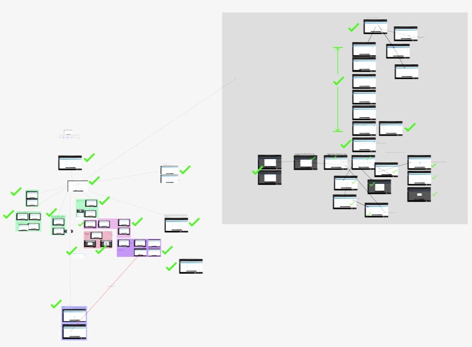
All the product-feature screens grouped and mapped on a figma board
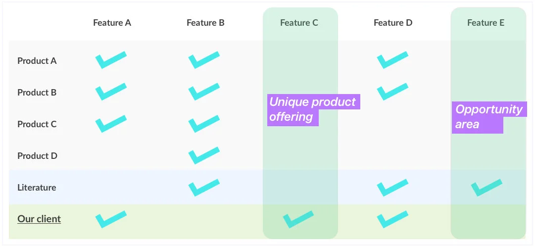
A sample competitive analysis chart to help clients identify what their current product offering lacks and potential opportunity areas to stand out
Competitive analysis
We studied a few other data catalog product offerings that are already in the market. We did a competitive analysis and shared that insights with our client to help them evaluate the product features they have built thus far.
Understanding user needs and their mental model
Despite the bureaucratic hurdles, we managed to gain access to a few teams within the company who would benefit from using a data catalog. We tried to understand how they manage their data needs currently and how their job could be made more efficient.
We studied their existing reports and how they are built, while we were trying to understand how their actual data is being distributed. This would later help us to make more tangible and implementable recommendations.
An interesting observation we made was that users would not want to disturb something that they have already built. We came to the opinion that users are more likely to use the new data catalog for their new data needs, like exploring new data sources, pulling entirely new reports, etc.
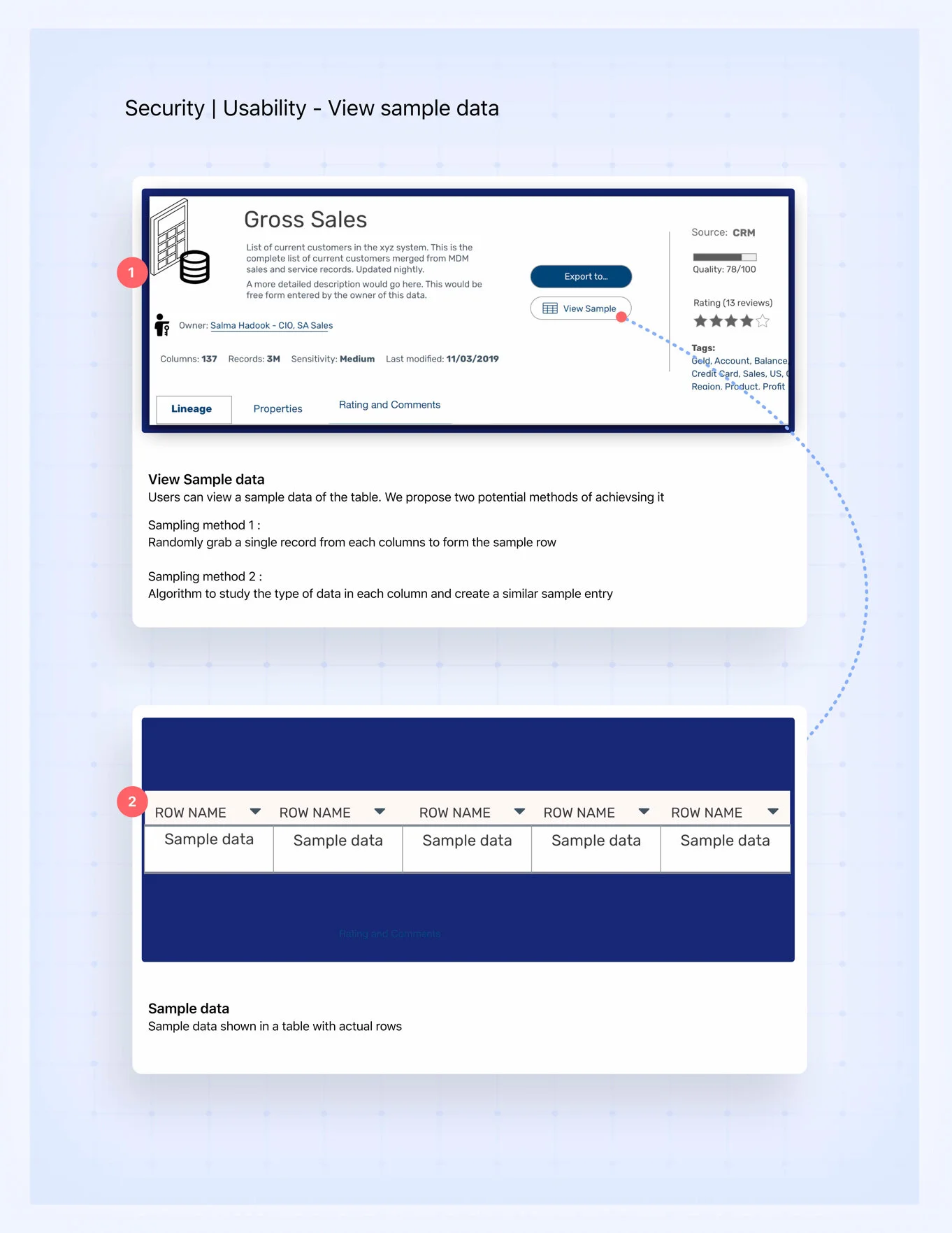
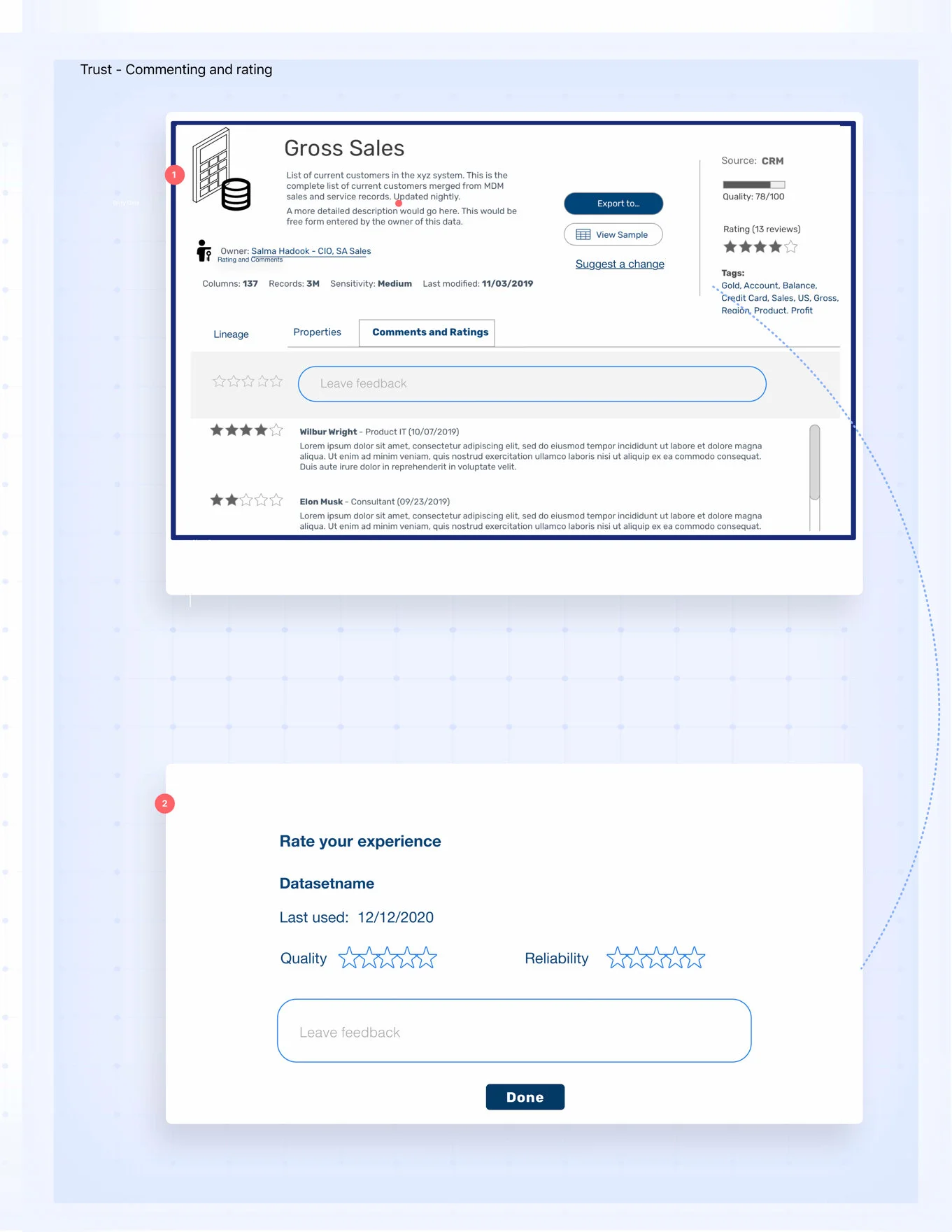
Design probes
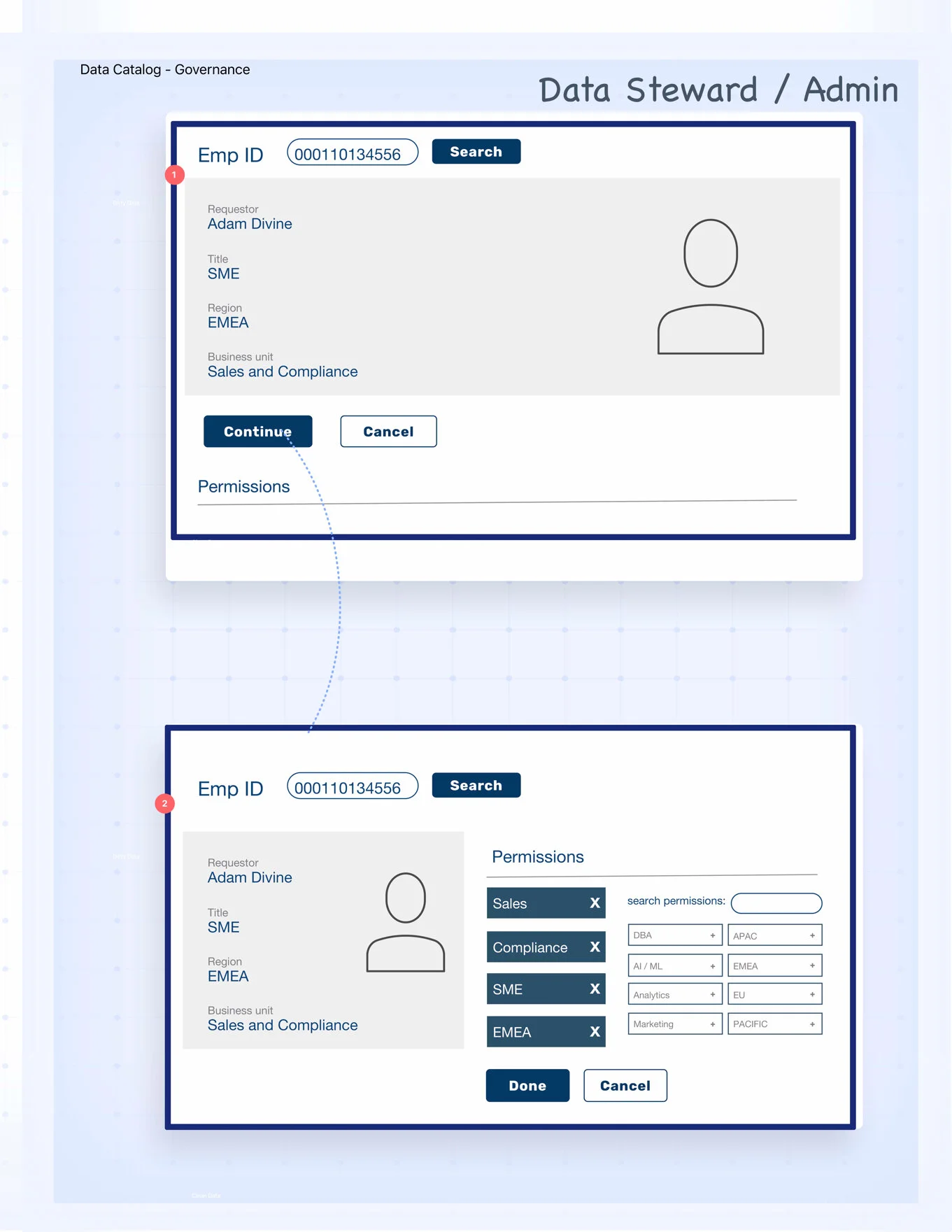
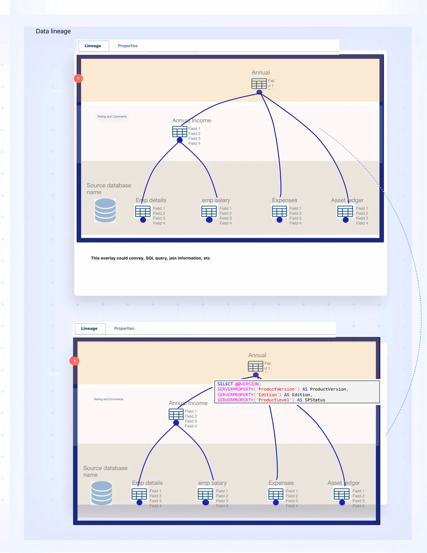
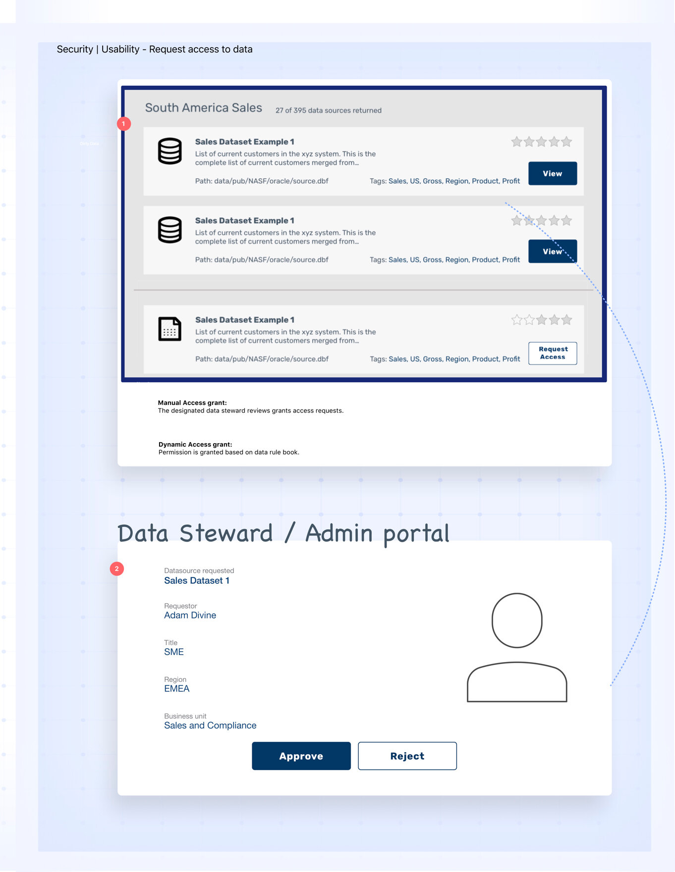
I designed the following concepts based on what we learned about data catalogs thus far. We ran these designs with our users to understand their mental model, their current practices, and expectations from a data catalog.
Building a Product Roadmap
Based on the competitive analysis and user insights, we conducted an alignment session where we all came to an agreement about what all essential features a data catalog must have and what other features this product could have to make it not just useful to them but also make it marketable to other companies. Then we designed a product roadmap to help our client get from where they are to the desired final state - all in a agile cycle to ensure faster deployment and incremental improvements.
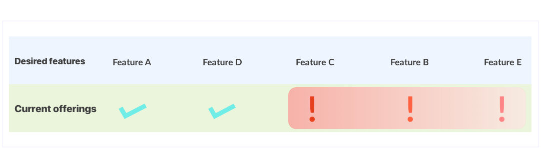
A sample infographic to help clients visualize the features they need to build vs all the desired features
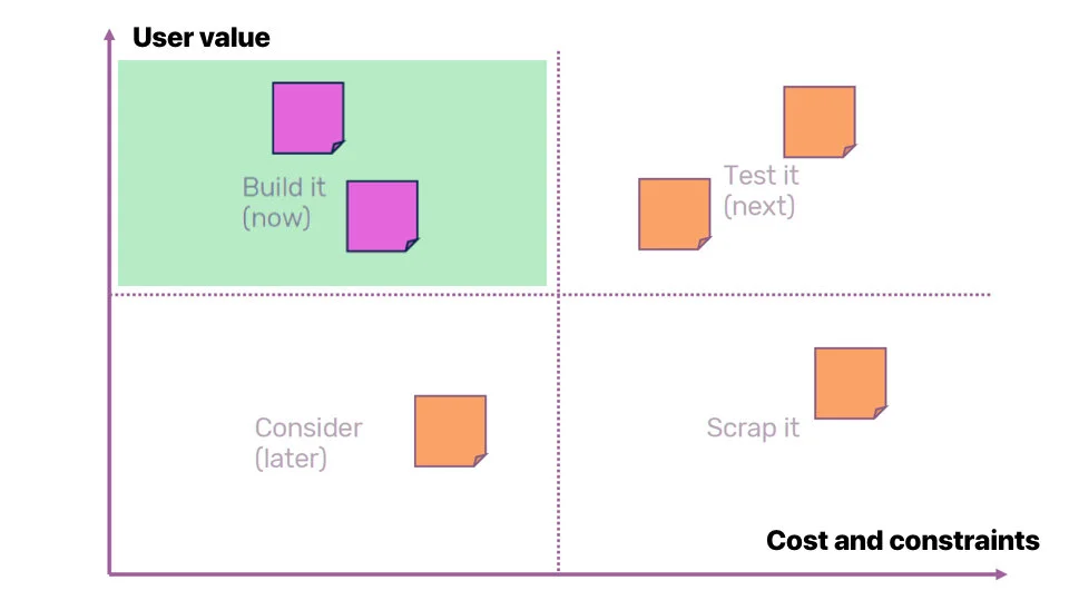
A cost vs user-value exercise to determine which features can be rolled out more immediately
The roadmap
Having analyzed all the screens and features of the product, we assessed that the product needed improvement at various levels:
Quick fixes: On-screen changes we need to make to fix the usability issues. These fixes included iconography, vocabulary, terminology, accessibility, adherence to interaction patterns, etc.
Improving overall product experience: These included changes to minimise the learning curve and make the product intuitive and easy to use. We suggested:
Coherent grouping of similar features and categorization of the feature types.
Making important features most accessible,
Suggesting standard and more contextual infographics and visuals to represent data,
Enhancing consistency in Information Architecture,
Creating help, guides, tips, FAQs where needed, etc.
Missing features: Based on the Competitive analysis and SME insights, we also identified several important features that were completely missing in the product, while certain features we identified as less valuable were built with heavy investment. This part of the roadmap involved prioritizing these features based on value.
Finally, we put together an action plan of how the design and dev teams can continue working by making incremental enhancements.
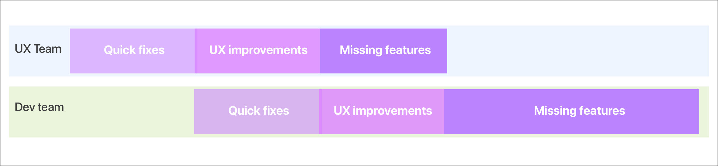
Proposed timeline for future work.
Quick fixes
Based on the agreed roadmap, I identified several quick fixes and UX/UI changes across all existing screens and features. With the help of our visual designer, we created a detailed InVision handbook, which helped the dev team identify and implement our suggested changes on each screen.
Since our client’s dev teams were very distributed and less coordinated. We left enough instructions and updated all screens with all the enhancements, so that they could implement the changes without any conflicts.
Dashboard page of the inVision handbook we created. All the screens are categorized into features. Users could navigate across screens and different sections effortlessly while also learning about the new categorization
A snippet from Sketch file showing two of the several screens we recommended enhancements. The screens on the left side are the original screens with suggested enhancements, and the right side screens visualize those changes. Pink pointers represent quick fixes, while the blue pointers are for future UX considerations. Users can swiftly switch between the two pages by clicking the toggle in the bottom right.
UX Improvements
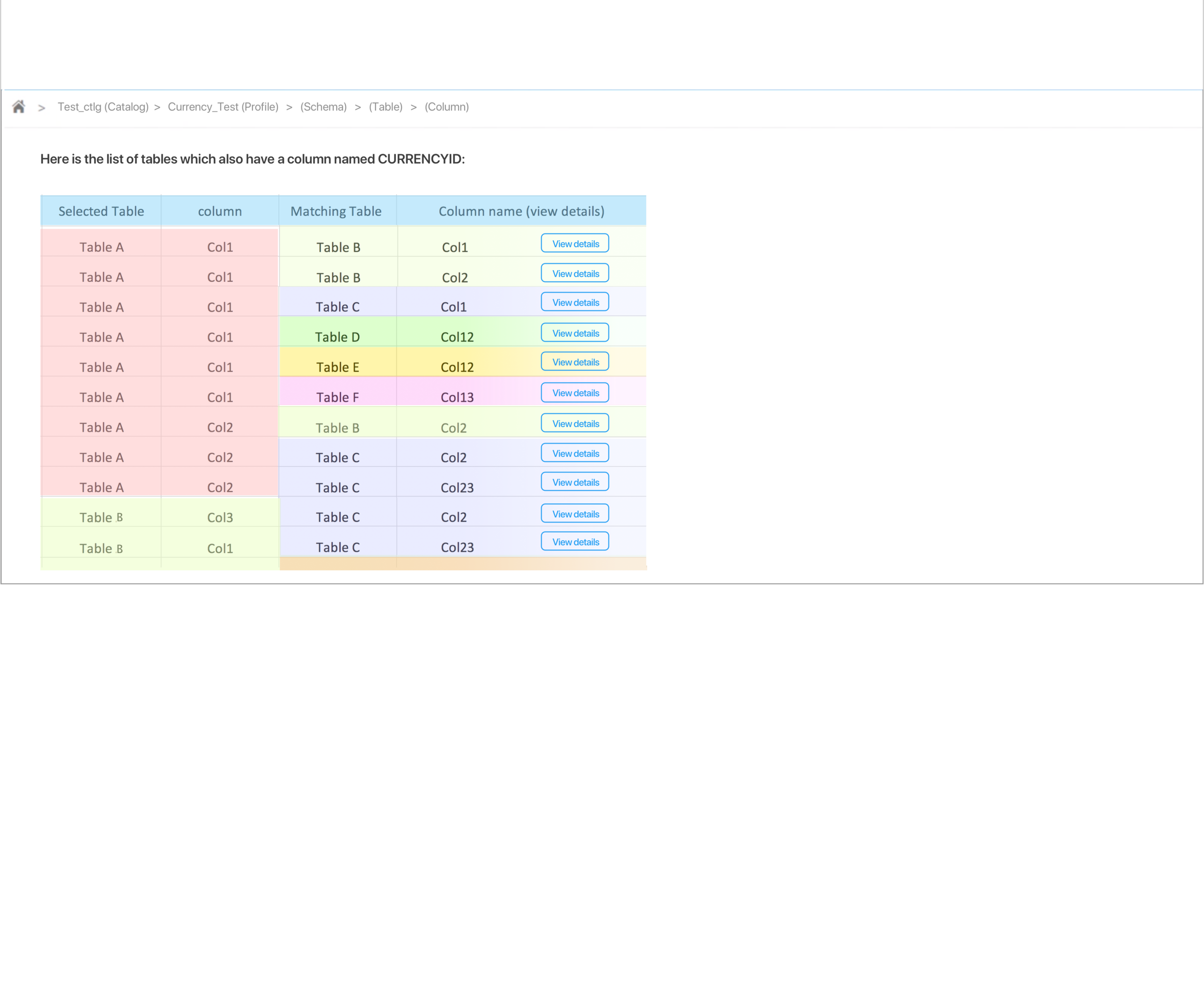
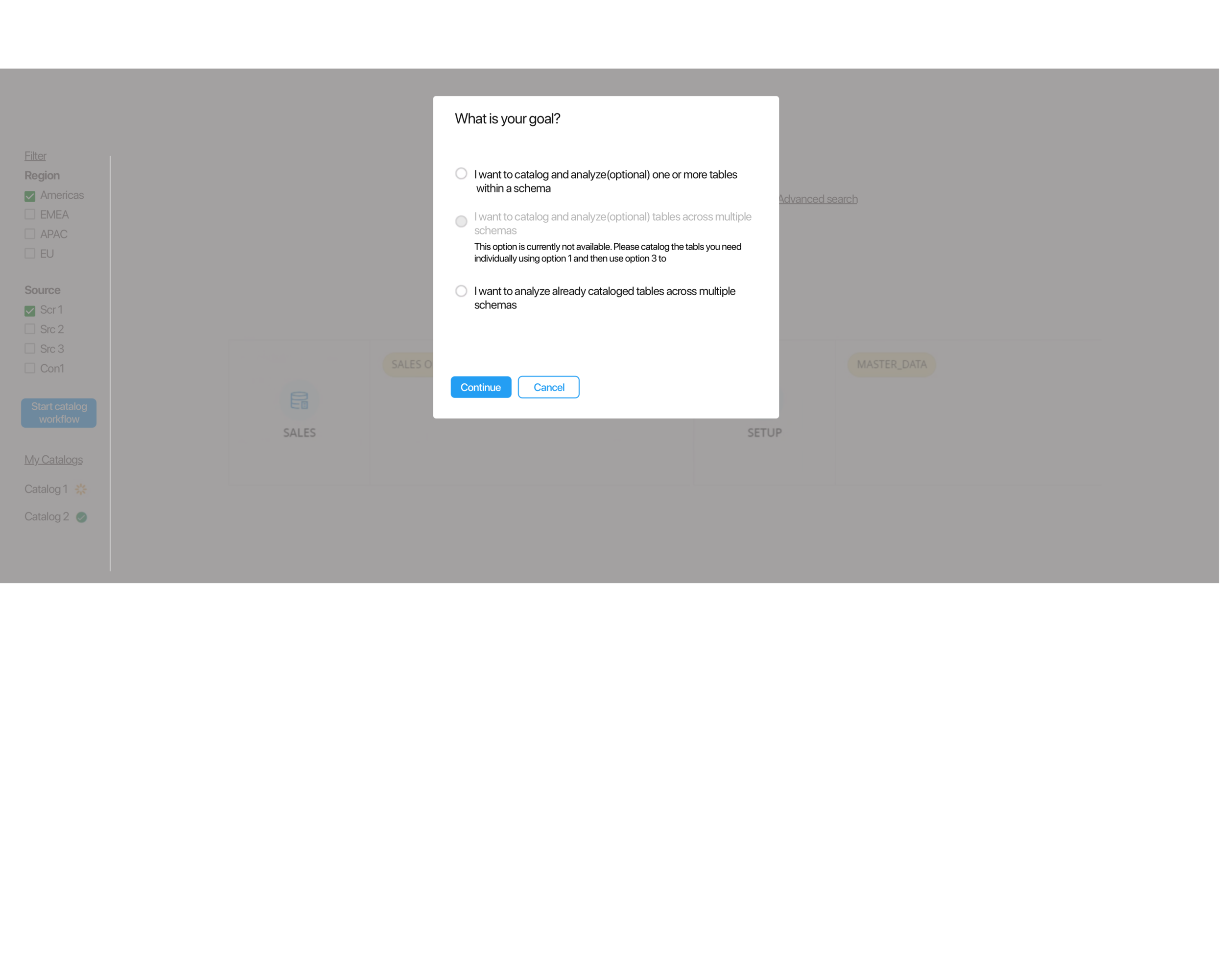
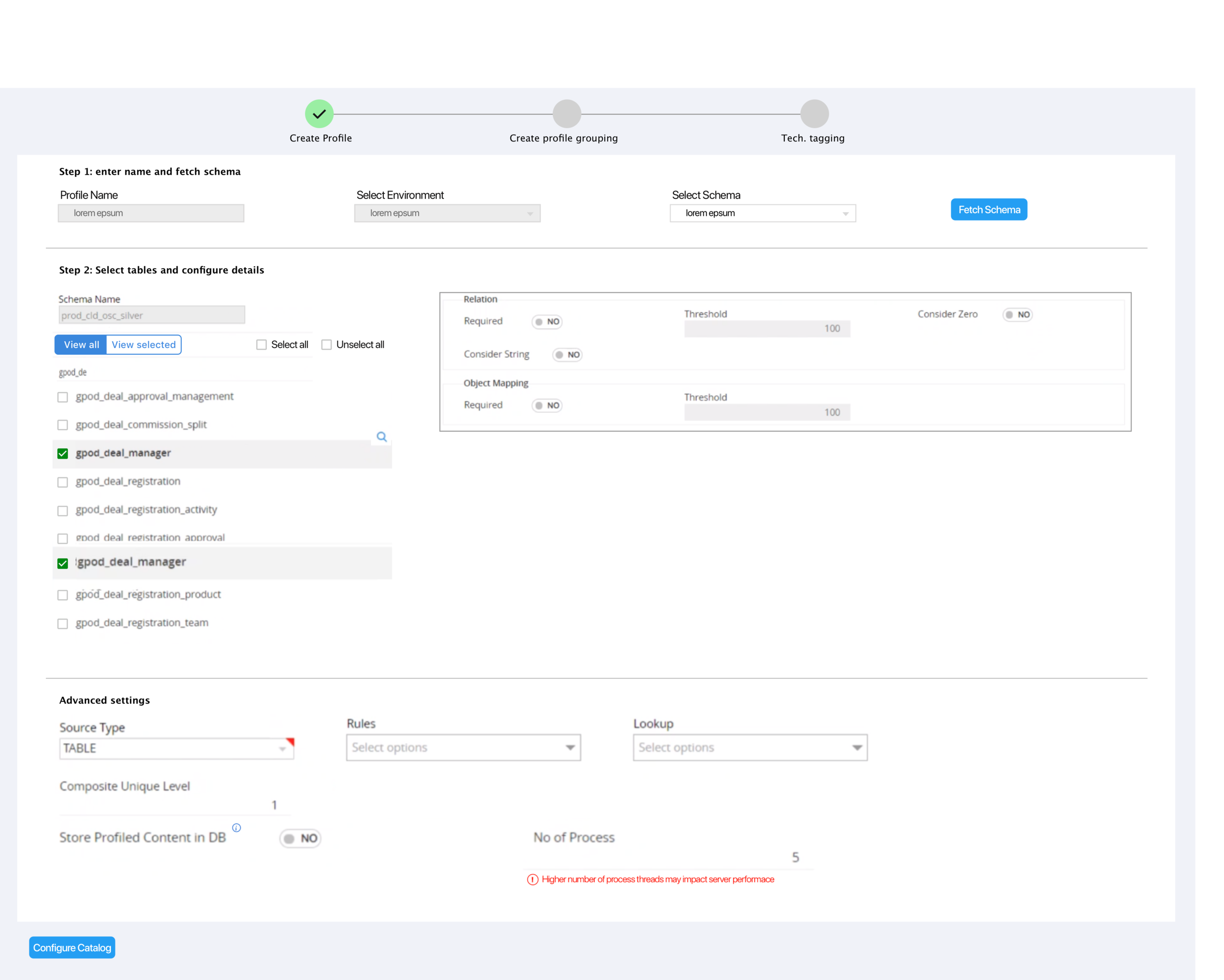
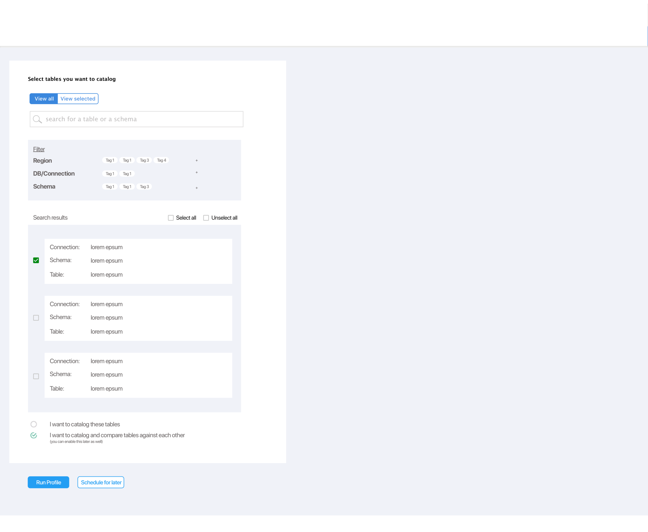
The next phase of the project has not kicked off yet, but as a starting point to kick off the conversations, I designed these UX feature improvements based on our findings thus far.
User tasks- I defined certain specific tasks users would perform using the catalog. I kept these tasks in mind when designing solutions.
wants to catalog a table
wants to catalog a group of tables (within a schema)
wants to catalog a group of tables (across multiple schemas)
wants to analyze a group of tables (within a schema)
wants to analyze a group of tables (across multiple schemas)
Reflection
This project gave me great exposure to working with complex data systems and restructuring the product strategy of an already built product.
Also, we all walked into it with almost no knowledge about data catalogs. This project pushed our limits of learning on the go.
I had an opportunity to make several usability improvements and also lead efforts for the overall user experience improvements for the product.