WE ALL HAVE SOMETHING TO TEACH &
WE ALL HAVE SOMETHING TO LEARN.
-Glerb.com
Authoring tool for Glerb
" Two weeks of a project, experience of a lifetime "
Duration : 2 Weeks | Team size: 4 | Extended Team: 8 (4+4)
My Roles: Facilitator, Concept generation, User research, Wireframes, Usability testing.
CHALLENGE
Create a contribution app for Glerb.com - an E-learning platform like Lynda.com. Contribution apps is a new concept introduced by Glerb which enable innovative ways for creating Online tutorials unlike the traditional methods like video, multiple-choice, blanks etc.
UNDERSTANDING GLERB
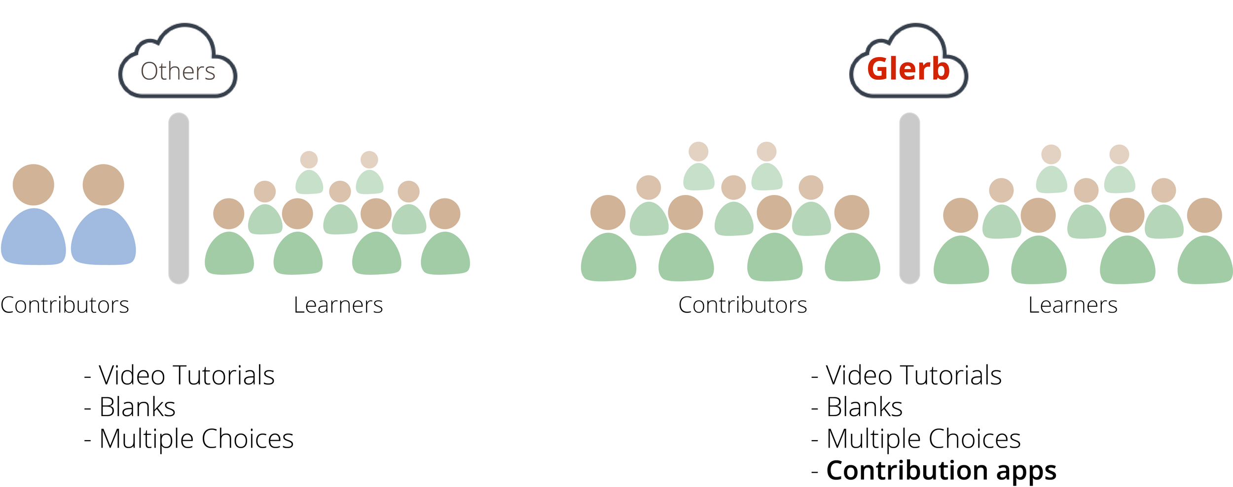
- Glerb.com is first of its kind web-based ecosystem which enables everyone with computer literacy to create and publish tutorials on topics of their interest online.
- Using Glerb’s API, third party vendors can develop Contribution apps. These contribution apps will be used by 'contributors' to create tutorials on Glerb.
THE BIG PICTURE
THE GROUPS, AND DIVISION OF LABOR
A Contribution app will have two interfaces, each led by one team:
- Contributor-side team: Design the interface for the contributors who create tutorials.
- Learner-side team: Interface for learners. 'How is the tutorial taught.'
Two teams form one group, A group works together to design one Contribution app.
I was the facilitator for Contributor-side team.
GROUP =
CONTRIBUTOR-SIDE TEAM
+
LEARNER-SIDE TEAM
FINAL DESIGN
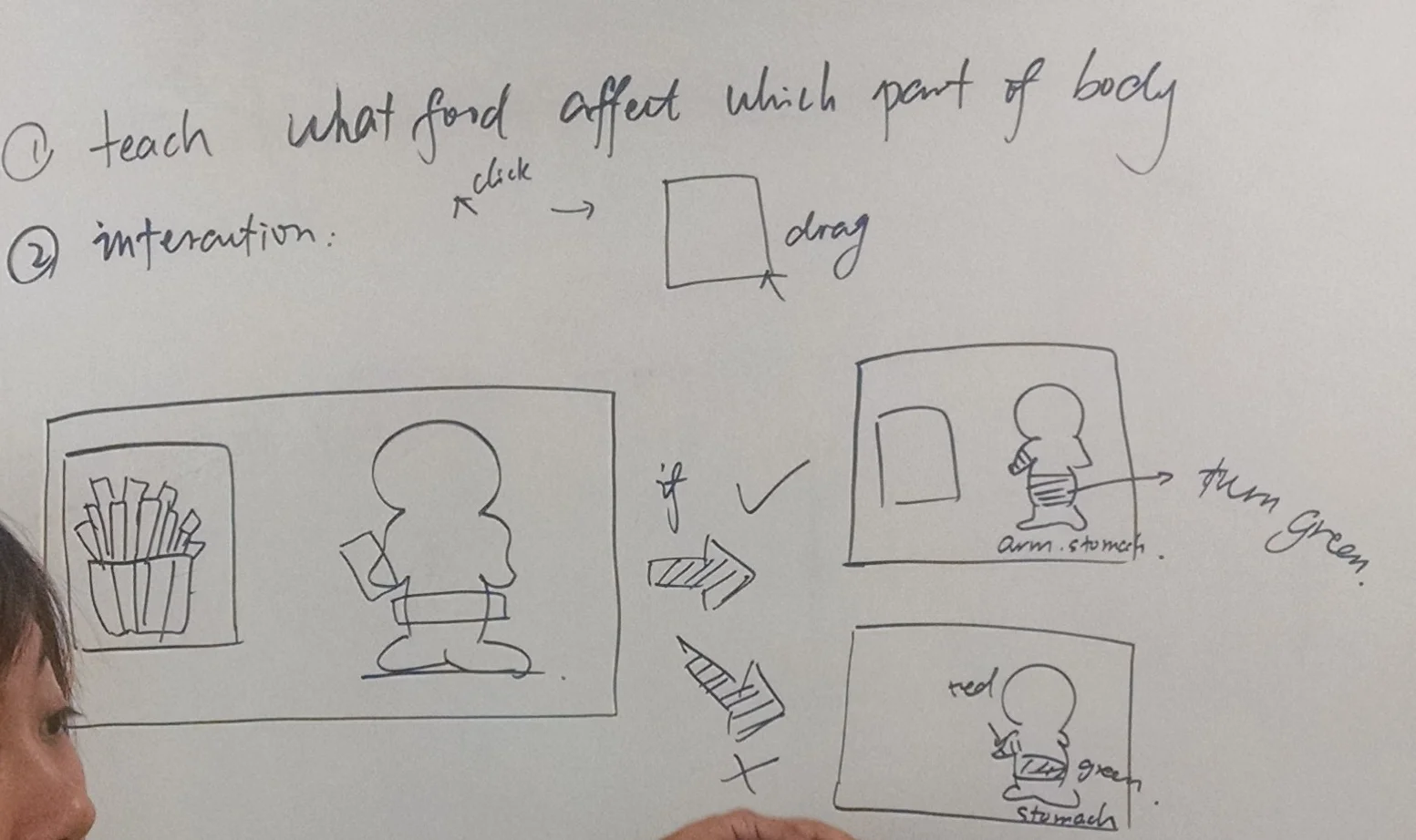
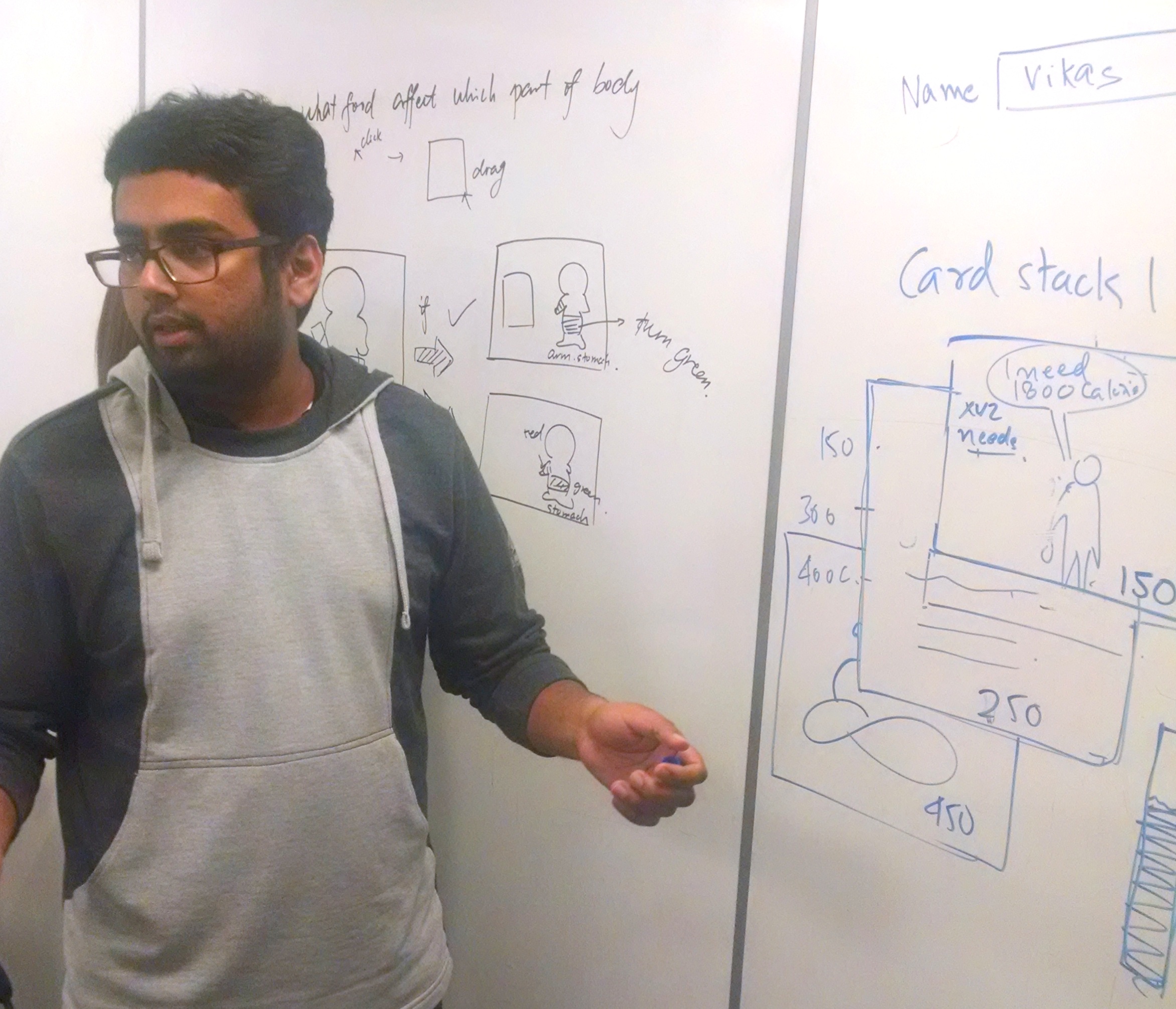
Our contribution app helps creating tutorials to teach parts of an item in an innovative, enticing, and efficient manner. Example: parts of an eye, parts of a Car, Solar system; almost anything imaginable.

Mockup of the Contributor-side interface for the app.
Final Design low-fidelity prototype : Creating a tutorial to teach parts of an eye.
DESIGN PROCESS
DESIGN PRINCIPLES
Before concept generation, we interviewed two people - a professor, and also the founder of Glerb, Marty Siegel. These insights helped us form core design principles for our contribution app.
Generalization
A principle that Glerb adheres to, meaning that tutorials on Glerb help people learn by "understanding" the content and not by "memorizing" it.
Minimal learning curve
This is important because several other contribution apps like ours will be available on Glerb. Both learners and users may have to understand one or many other such Contribution apps.
Motivation to learn
Since we were on contributor’s side, I felt that professors were ideal and also easy accessible in a college town to understand difficulties in teaching. I interviewed a professor to understand problems in engaging with students. We learned that keeping students motivated during lectures is a big challenge for professors.
Confidence & Competence
"Imbibing Confidence and Competence for its learners is an operating principle of Glerb." - Marty Siegel, Founder of glerb.
CONCEPT GENERATION
Given less time, and availability of abundant inspiration online, we quickly started sketching out several concepts of what our contribution app could be, while making sure it met our core design principles.
CONCEPT 1
After several rounds of ideation using a 'yes-and' technique, Both the teams of the group (yes, 8 people) formed our first concept of the contribution app:
A running game to teach right/wrong, good/bad choices. The learner has to "swallow" the right choices and "avoid" the wrong ones.
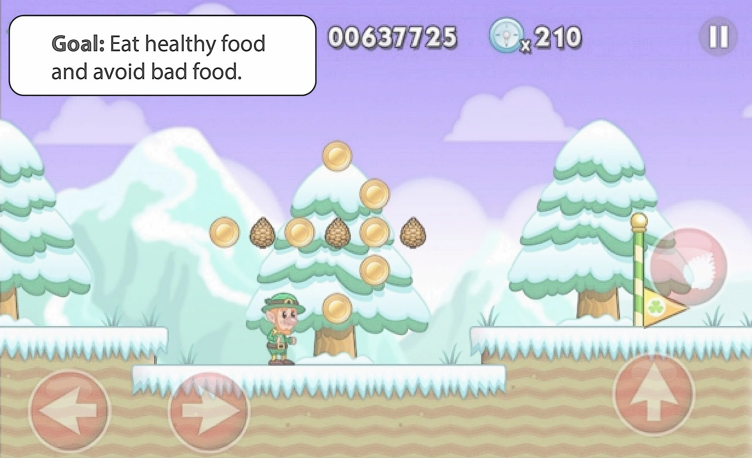
**Concept illustration - A nutrition tutorial teaching good and bad food choices.
The CEO threw a 'curveball', we were paired with a different team, leaving us with two completely different design concepts to choose one from. As the facilitator, I was tasked have a one-on-one meeting with other team's facilitator to present our concept and win their approval.
For a group of naive designers, it was very hard to let go off our designs. We finally worked together, and came up with our final design adhering to our design principles.
CONCEPT 2
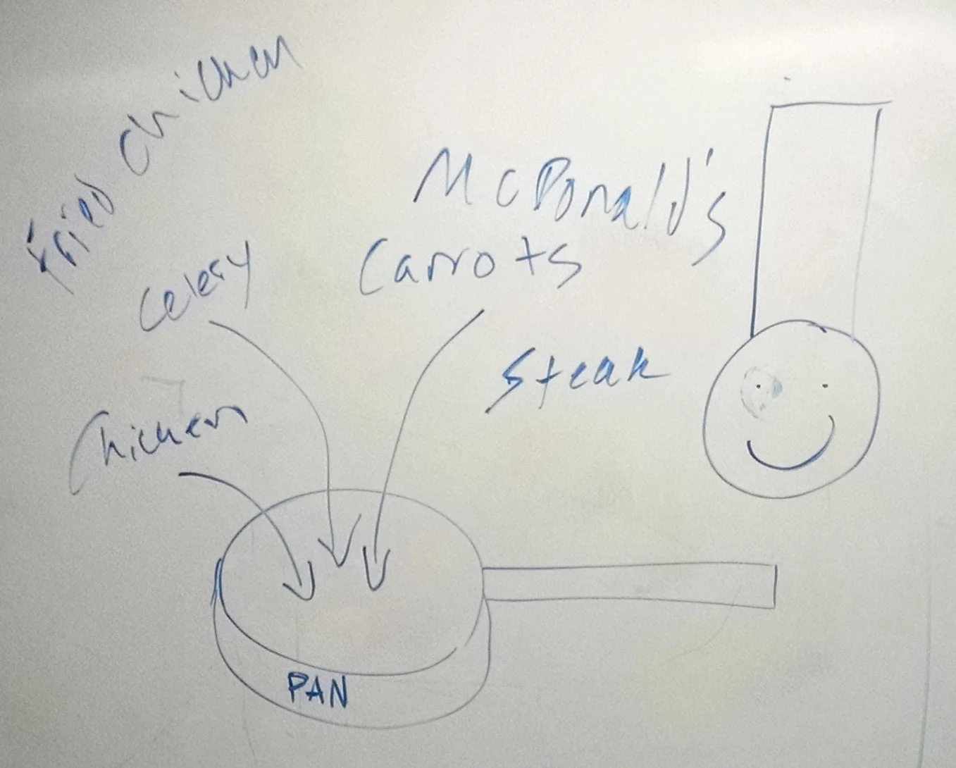
Our second concept, which after a couple iterations turned out to be the final design was, was a contribution app which enables contributors to create tutorials to teach parts of an item, for example parts of an eye, an engine, Solar system etc. My team and I were inchange of the contributor's end.
Paper prototype of Concept 2: We designed the user interface for the Contributor's side.
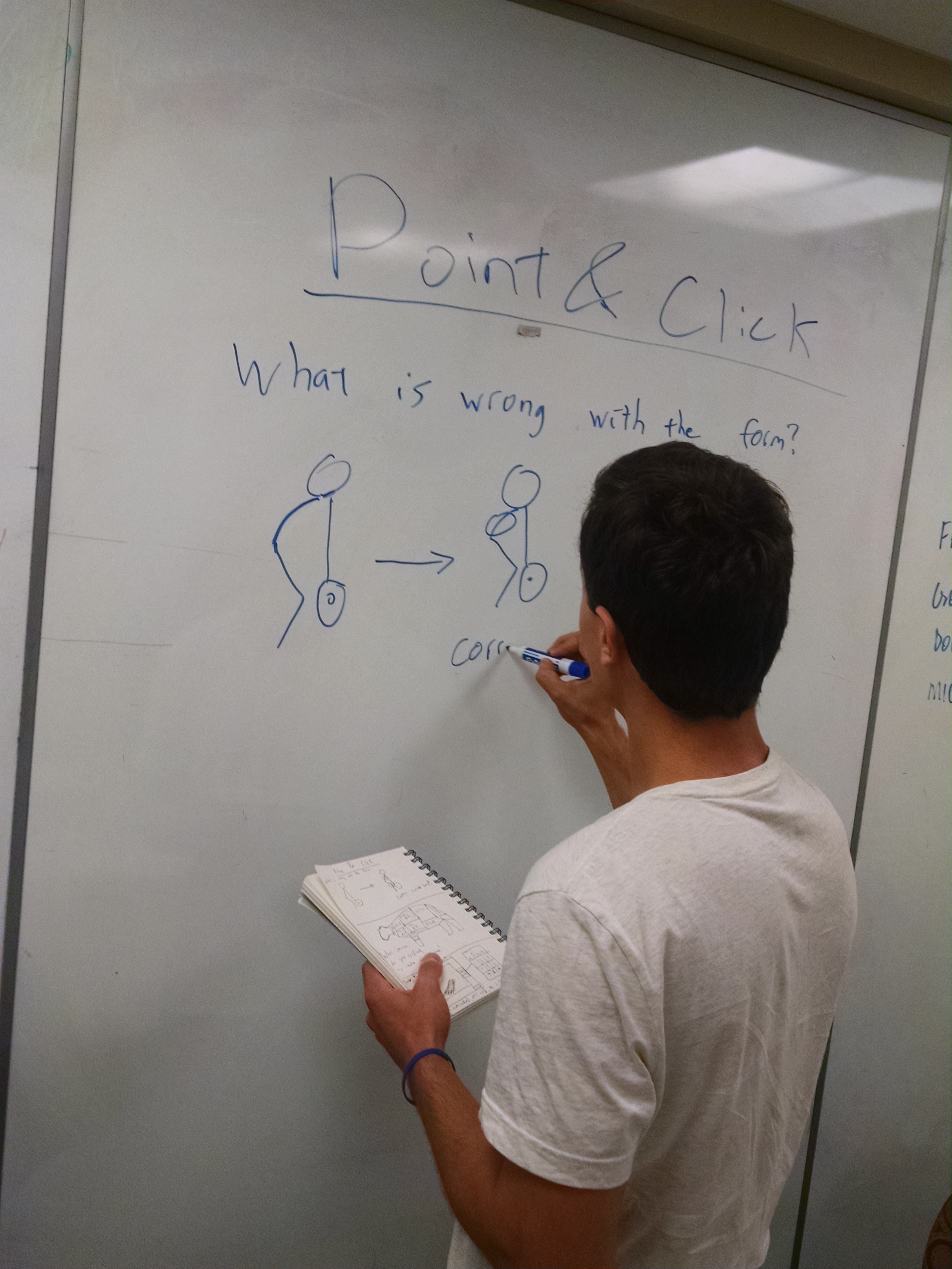
USABILITY TESTING
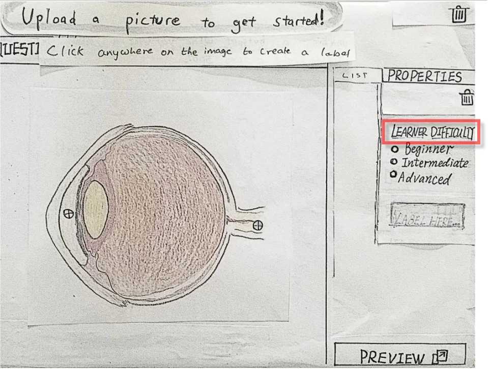
We conducted usability test our paper prototype on four people, we found that users were particularly finding it difficult to understand the purpose of "Learner Difficulty" selection. We initially designed that label to help contributors determine complexity of each label they create. Glerb would use this information to teach labels in a strategic manner. Ex: easy to difficult.
ITERATIONS
ITERATION 1
We fixed the issue by adding a descriptive text. (It was a difficult decision to make. More about it under the Reflection section!)
The following wireframe demonstrates the Iteration 1 with an example to create a tutorial for identifying parts of an eye.
Demo: Iteration 1
ITERATION 2 - FINAL DESIGN
Based on critique received from CEO and acting stakeholders, we iterated to make our app more 'Computer Imaginative' (Prof. Marty Siegel). It means that a design must utilize the possibilities that the current technology enables us to do things in ways not possible before.
We made following changes:
- Multiple variants of same item (upto 4) can now be added into each tutorial. (ex: front view, side view, bisect-view etc.)
- Images could be flipped or rotated
- We added 'Tips' to guide beginners throughout the process
- Removed "Difficult Level" selection because we later learned that Glerb will automatically learn that information based on learners' performance once the tutorials goes live.
- The and order and position of the labels being displayed would be changing randomly (Learner side).
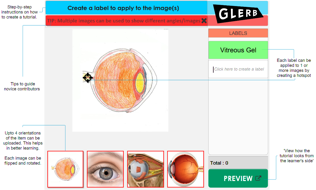
Iteration 2 - Final Design
Demo of the Final Design - ⇑ take me there. ⇑
REFLECTION
Killing a baby - It taught me how to stop my personal biases and attachments from hampering project’s progress.
Ask the user, do not assume - During Concept 1 (running game), we debated over keeping "scores and levels". My argument was that having scores and levels distracts learners from focusing on learning. We had another argument when deciding about the descriptive text for the label 'Difficulty Level'. As a facilitator, I was frustrated at my inability to bring everyone on the same page.
After talking to my instructor I realized that such debates were just based on "assumptions" we were making about what is good for users. After talking it out, we made a practice of doing mini rounds of user-testing when such debatable situations arise instead of making such assumptions.
Embracing the conflict - This project was the most stressful of all projects for the IDP course. I learnt that conflict is an integral part of design process. A designer must learn how to embrace it.
Learning and Reflecting is key to growth as a designer, well, as a human being, too.